Happy Thanksgiving Gastronomic Aftermath, everyone! Given how closely linked nutrition and sustainability are, we thought we’d share this neat infographic from “Civil Eats,” a food justice blog partnered with the UC Berkley Graduate School of Journalism. In the animated infographic, you can see the “calories available per day per capita” for people living in the United States from 1970 to 2008. As a side note, we’re dying to see how this graph varies across the globe – hopefully UC Berkley students can continue on with that project! In any case, this graph shows the amount of calories an American individual has each day in each food group. As you run your mouse from left to right, the plate sizes (number of calories per food group) grow or shrink proportionate to time. Between 1970 and 1980, calorie intake only rose
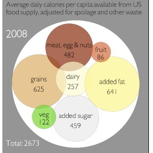
 1.2%; from 1990 to 2008, the average American caloric intake increased by more than 20% from the 1970 value, with 2,673 calories available per person per day. The amount of grains and added fat far outweighs the caloric intake from other food groups, indicating a heavily over-processed market. Though this graph recapitulates the obvious – eat more organic fruits and vegetables, and less in general – we know we need a gentle, visual reminder to keep our families in check at this time of year!

Minds On Music – The Kindermusik Blog
For three generations, Kindermusik has helped millions of children around the world build a strong foundation for a lifetime of learning.